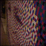
When I was in high school, one of my art teachers showed us a video detailing the creative process of painter Chuck Close, and I was completely blown away by the way he dissected and reassembled images on a large-scale. I’ve since found a great book that extensively covers the many methods he’s used over the years: Chuck Close Prints: Process and Collaboration. There’s also a similarly-titled web site that serves as a great overview of Mr. Close and his work (Check out the breakdown of his ‘scribble etching’ self portrait here). Ever since being exposed to these works I’ve been obsessed with anything resembling the methods used to create them.
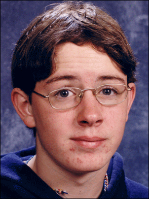
In the last months of the year 2000, I made a lego mosaic depicting my late brother, Chris. Legos aren’t the cheapest thing in the world to buy in bulk, so much of that project was funded by returning empty bottles and cans, and using the resultant refunds to purchase the now discontinued ‘blue tubs’ of assorted bricks. On one such trip, I joked to a friend who happened to be with me that my next project would be a mosaic of beer caps, and that my drinking habits would soon be dictated by the graphic design of a beverage’s captops. This was one of those instances when you say something and realize as soon as you’ve said it that it might not be such a bad idea after all. It was appropriately ridiculous.
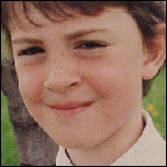
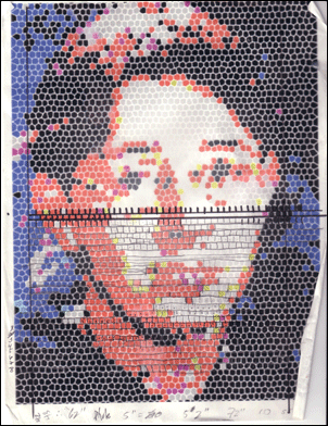
Soon after, I started saving caps. I saved for about a year before I even started entertaining the idea of beginning to assemble such a monstrosity. Because of the size of a bottle cap (approximately 1″ diameter, compared to ~.25″ width of a lego ‘square’), the finished mosaic would have to be fairly gargantuan to resolve to an image of roughly the same clarity. I made up my template for the mosaic in the summer of 2002, running another photograph of Chris through a ‘stained glass mosaic’ filter in photoshop. I applied the filter at several different resolutions, ranging from meticulously detailed templates that would be a story or two tall if actually constructed, to the absolute minimum resolution at which the project would still be worthwhile (‘Worthwhile,’ in this case, is of course a subjective term – I use it here to mean ‘The image would still be discernable’).
I eventually picked one with a resolution somewhere in the middle, to balance the percieved detail against the sheer number of caps that would be required. Sometime in late June 2002, I sorted my collection (which was a five-gallon bucket’s worth at that point) roughly by color and began to determine which caps would correspond to which colored ’tiles’ on my rendered template.


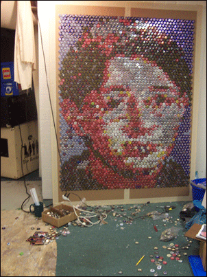
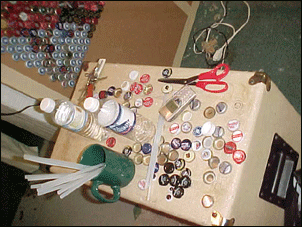
I started to arrange the first few rows, just to get an idea of what I was in for, and determined that I was going to need a shitload of caps. At this point I briefly considered re-rendering a smaller scale template to expedite the project’s completion, but I finally decided the extra resolution would probably be worth it. At this point I was simply ‘laying out’ the rows on an empty desk in my basement. As I worked beyond the first few rows, it became clear that I would need some way to keep the caps stationary. The solution I arrived at was to use a Ginourmous piece of cardboard and a hot glue gun to hold the caps in place. Using this technique, I tore through my accumulated cap supply in the first dozen rows. I then began the arduous process of cap collection, applying new rows as my supply allowed. This slow collection / gestation period lasted from the summer of 2002 through early 2004.
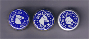
During this period I could often be identified by the characteristic jingle of a few day’s worth of accumulated bottle caps in my pockets. I developed a ridiculously comprehensive knowledge of the color of nearly every locally available bottled beverage’s cap, and as prophesized, soon began to alter my drinking habits accordingly. I was intimately aware of any changes in cap design – Which, incidentally, occur fairly often. These changes could be subtle, as illustrated in the slow evolution of the Rolling Rock caps seen below:

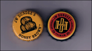
…or drastic and sudden, as in the case of Honey Brown’s lame ‘modernization:’

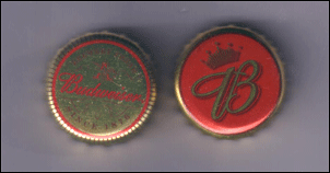
At various points, as I worked my way down the rows of the mosaic, the ‘in-demand’ colors changed. A cursory glance at the template above makes it fairly obvious that red, black, and white were going to be the most valuable. As such, I was pretty happy when Smirnoff Ice launched with almost completely solid red cap, and was almost overjoyed when Budweiser changed their cap from a useless gold to a predominantly red design.

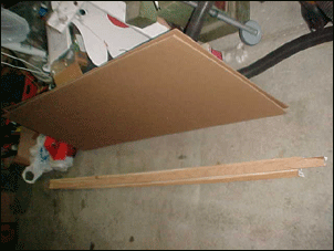
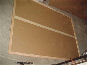
Sometime in Late 2003 it became clear that the ‘ginourmous’ piece of cardboard I had begun with was not going to be large enough. This fact, coupled with the difficulty I had begun to experience in moving and storing the mosaic-in-progress while not working on it, convinced me that I was going to have to come up with a better, more permanent mounting solution. In March 2004 I finally got my shit together and built a sturdy wood frame, found some appropriately gigantic sheets of cardboard, and began final assembly.


In doing so, I was faced with the monotonous task of transferring the rows I had previously completed to the new ‘canvas.’ I decided to document this process in stop-motion form, and the end result came out way better than I anticipated. Click below to view the 1.8 Mb animated gif file.

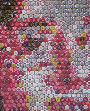
I finally finished the last row of the mosaic this week. I may still ‘touch up’ the white areas, as I’ve recently sorted out a supply of better quality ‘whites.’ The finished mosaic Uses 2,635 caps, and measures roughly six feet tall by four feet wide. It took me a little over three years of periodic attention to complete, which is probably longer than I’ve ever spent working on anything else (Besides my degree).
I need to thank literally tons of friends who helped with collecting caps, this project would have taken even longer without their help and enthusiasm. I’ve been collecting caps for going on 4 years now, so it’s very likely I’ve forgotten several people, and for this I apologize profusely. I would be more than happy to add your name if I forgot you. An extra special thanks to Jackie Valko who provided a wealth of much-needed reds towards the end.
- Sarah Fabian
- Krysta Stone
- Wendy Stone
- Zach Curd
- Holly Pratt
- Theresa, Mo, and Jackie Valko
- Erik Koppin
- Thunderbirds are Now
- Red Shirt Brigade
- Army / Navy
- Erin Elise
- B&N #2648 Employees
- The Michigan Hat Bartender at the Loop
- Joe Cwik
- The Recital
- Eve from NYC
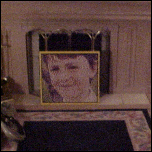
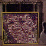
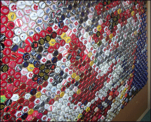
Clicking the image below will open a new window with a side-by-side comparison of the original image, the template, and the (almost) finished mosaic. The shape of the bottlecaps gave the final product a sort of horizontal distortion that is only apparent when viewed next to the template.

And here are a few more ‘detail’ shots of the finished mosaic and the process.


The mosaic will probably be on display at this year’s barn show, an annual event that raises funds for the Chris Kempa Memorial Scholarship Fund (Offering art scholarships
to students at Livonia Franklin Highschool since
2001).
Other Bottlecap Art
For some reason, whenever I told people I was collecting large amounts of bottlecaps, they always assumed I was making a coffee table. While I haven’t found any evidence that anyone has ever tried constructing a bottlecap mosaic before me, I have turned up several examples of bottlecap art on the internet. Here they are, in a handy bulleted list format: (Update! I’ve found several other mosaic examples, which I must admit is disappointing in a weird way. There’s an 8 foot by 8 foot bathroom floor, depicting a diver; a few giant college logos; the cover of Pink Floyd’s ‘Dark Side of the Moon’; and “The largest sign made out of bottle caps consisted of 105,000 Karmel beer bottle caps and was created by Browary Lubelskie S.A. in Lublin, Poland on June 19, 1999.” More info here.)
Know of any others?
Other ridiculous mosaics
In working on this project, I also found several examples of similarly ridiculous mosaics and large-scale re-renderings of various images. Here are some highlights:
- The new hot mosaic medium seems to be pieces of bread toasted different shades of brown, as I’ve found one group making a really big and well-executed one here, and another guy making tons of toast mosaics, of slightly lesser quality, here, here, here, here, here, here, and here. It could be argued that the toast mosaics I deemed ‘of slightly lesser quality’ are actually more ‘pure,’ as the entire slice of bread is toasted one consistent shade, while in the previous example, some inconsistent toasting is used to vary the relative darkness over the surface of each individual slice of bread. I digress, however, as this is an argument that no one but me gives a good goddamn about.
- One of the most intricate Lego mosaics ever can be found here, made using some weird sort of discontinued learning pieces. The resultant effect is that of ASCII art using small plastic characters. This was done by Eric Harshbarger, who does all sorts of insane stuff with Legos. Also: That’s his JOB. His other ridiculous mosaic examples can be found here, here, and here he documents the construction of a mosaic. Basically his whole site is incredibly good. Here he discusses his need for assistants, etc.
- The Photoshop mosaic filter as fine art: From far away these paintings seem to depict nude folks in engaging in varying degrees of intimate contact. Up close, it’s just a bunch of colored squares.
- Some pretty nice domino mosaic portraits are here.
- Glass mosaics of Hitchcock films in London: here and here.
- Two absolutely INSANE images (You need to see them both to ‘Get it’) that I grabbed off of an eBay auction that was linked somewhere several months ago. Image one: The big picture. Image Two: The lurking message. A few nice rebuttals can be find in this mosaic, assembled from images of America’s dead in Iraq; and this mosaic, assembled from photographs of actual assholes.
- Rubik’s Cubes solved to specific patterns in order to compose multi-cube mosaics.
- Several images recast as hook rugs.
Know of any others?
