Year: 2010

My Top 1 books of 2010: Touchable Sound

The short version

     If you are an aging, slightly art-damaged music nerd with a penchant for the 90’s and vinyl, you need to buy this book. If you have ever self-released music, or helped assemble a run of hand-made packaging: you need to buy this book. If the words “Fest band” conjure up vivid imagery for you, you especially need to buy this book.
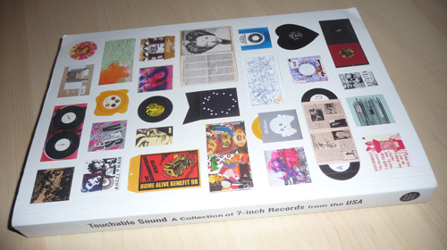
 

Touchable Sound.  Get it.

     If you know someone who meets any of these descriptions, and you are looking for a Christmas gift for them: you need to buy this book for them. This is the book my brain has been silently willing someone to compile for years.

Ok, now the long version

     Earlier this year, I wrote an article discussing the various capabilities unique to the vinyl record as a format. It ran in the July / August issue of The Believer, and while it focused on the oddities that can be pressed into the physical record itself, I’m pretty sure I managed to clumsily allude to the concept of the “record as an artifact” somewhere in there.

     A few months back, at the end of a random chain of links I’d clicked through, I stumbled across a book called Touchable Sound – A Collection of 7-inch records from the USA, published by Soundscreen Design. An entire book focused on the concept of the 7″ record as a physical artifact?! And it was already available?!

     I broke my current ‘Try not to acquire so damn many books’ embargo (It isn’t working anyway) and ordered it immediately, hoping for the best.

     I should say here that like any book-oriented music nerd, I have been burned by my fair share of ‘Album art’ books in the past. There is no shortage of books on the subject, and the bulk of them treat the artwork as a flat, square visual experience – completely divorced from the physical object onto which it is printed. Furthermore, the covers included in such collections often seem to have been selected based on the names of the artists on the records they were created to package (Try to find an album art retrospective with no Beatles, Rolling Stones, or Pink Floyd). I couldn’t be happier to report that this book is the exact opposite of those books – the content was seemingly selected with absolutely no attention payed to the audio component of the artifact at all. All records that are included are painstaking, tactile creations, photographed as objects.

     Obviously, a big part of why this book connected so strongly with me is because the years during which I was personally immersed in record nerdery fall within the window of time it covers – Troubleman Unlimited owner Mike Simonetti perfectly summarrizes a few of my formative teenage years in one brief sentence:

     “The process involved scouring zines for advertisements or reviews, sending “well-concealed cash” to the label (whose owner hopefully hadn’t moved in the time it took the ad to reach the reader), and checking the mail every day for up to a year while waiting for the record to arrive-if it actually showed up at all.”

     I think there’s a lot more to the book than simple nostalgia or designy navel-gazing, though. Beyond getting the selection process right, the editors have added several additional layers of context to the records they present: the collection is broken down by region, and by label within each region. These regional sections are punctuated with essays written from the unique perspective of the label owners that facilitated many of the records pictured elsewhere in the book.

     Much of the sneaky dual-function I see in this book lies in these essays. Themes that don’t often appear in ‘Business of music’ books are covered from a number of viewpoints, and the wheathered tone of experience runs through all of them. Discussed: the economic necessity that often informs aesthetics or design choices, the romanticism and ritual of production-line record assembly (The first section of Chunklet Editor Henry Owings’ introduction is titled “I’ve spent months of my life assembling records. No Joke.”), and the weird mix of futility and passion inherent in pouring hours of manual labor into a musical artifact aimed at a limited audience (A refrain of “What were we thinking?” echoes throughout the book).

(An aside: if you are currently involved in producing vinyl in any way, it is worth paging through this book solely to marvel at the ridiculous press runs some of these 90’s records had.)

     Perhaps the most striking section of the book is the afterward – an interview with Sam McPheeters, one-time singer in Born Against and helmsman of Vermiform records. Though making and selling music were both central elements of his life at one time, he now spends the bulk of his time as a writer. This distance has seemingly put some of the DIY revolution he lived through into perspective, and he isn’t shy about cutting through the romanticism:

     “Throughout the 1990’s, the disincentives to identify with underground music (violence, ridicule) plummetted at the same rate that the cost of production (CD pressing, online distribution) plummetted. But the subculture’s core message – anyone can do this! – remained constant. So bands and fanzines and record labels became the default pursuits of a generation. A lot of people think this is a good thing. I don’t. I know too many folks who plod along with their bands or record labels purely due to inertia, because underground creativity is a tradition that extends just far enough past their own life span that it seems like an enduring lifestyle. That was certainly my sorry state for a few years.”

     “I understand this is an elitest sentiment, but consider the big picture. The specific era covered in your book-megawealthy post-Cold War America-is an anomoly in human history. Not everyone should make art. Not everyone should be in a band. Some people have to farm, and repair bridges, and make socks. I certainly wish I’d learned some practical trade 20 years ago.”

     Whether you agree with his sentiments or not, the five-page interview serves as a perfect coda to the conflicted narrative built up by the arrangement of the book: full-color sections celebrating these artifacts, sandwiched between the often melancholy conversations with the people responsible for creating them.


Inception

     So: I cannot stress how much I loved this book, and how much I would love for further volumes to someday be assembled. But! Sometimes, reading about the production of nerdy things (in this case, records) just isn’t quite enough – sometimes I want to read about the production of nerdy things (books) that are themselves about the production of nerdy things (records). Luckily, Mike Treff, one of the editors of the book, was kind enough to answer some questions I had about how the book was put together. Book nerd alert.
Co-Editor Mike Treff

Me: What’s the story behind the book? Did all of the editors have a background in running labels?

     “When I started Soundscreen, the idea for this book was something I had been kicking around for a long time. I was already working with Brian Roettinger (my co-editor and the book’s designer) on our company’s identity, and his background running Hand Held Heart, both a record label and design shop, was perfect for this project. We talked about this book and just dove right in. Diego Hadis (co-editor) and I were working together on a few projects, and he had previously worked at what was my favorite NY record store, Sound and Fury, for years.”

     “I have always been fascinated with the 7-inch as a format, and further by the amount of labor that went into so many of the records I bought growing up at hardcore shows. Often a record clearly took months to make, with the band or label screen printing, embossing, die-cutting, and using just about every other mode of production known to hand to make a record, that they ended up selling for $3. While that effort alone is enough to fill the 412 pages of Touchable Sound, we also wanted to highlight the exceptional design and packaging that was resulting from this approach. It’s a vital part of the story of underground music that is rarely told. Just like poster books, there are many books on record design that focus singularly on the cover image, which in the case of Touchable Sound is only a fraction of the story. It’s that story we wanted to capture.”

Me: How did the work break down amongst the various contributors?

     “It was a total team effort, all the way around. We all were involved in the selection process, we all did research, we all collected information for the records. When it got tactical, we each played to our strengths. Brian took the lead on design, and Diego took the lead on actual text editing. As editor and publisher, I handled much of everything else, from production to content creation to sales and marketing.”

     “It was a near 2 year process from start to finish, which given the fact we reviewed almost 30,000 records, doesn’t seem that bad!”

Me: What was the selection process like? Were there any tough decisions as far as what to include and what not to include?

     “The selection process was endless, literally. We would be prepared to review the next 500 records for consideration, we’d discover a new label or band or collection to mine that we had not previously included, and so it began again. We probably had at least 20 review sessions where we went record by record to determine the final set, and that’s after we each reviewed countless records to bring our recommendations to the selection reviews.”

     “There were a ton of heated discussions about why a particular record needed to be included or discarded, but that was actually a really fun part of the process. We each had our own sensibilities and ideas for what the final set should include, and I think we found a nice balance in the end. I do feel like its a well rounded collection, that is representative of all the different aspects of our general theme, exceptionally packaged, labor-intensive 7-inch records.”

Me: Do you have a personal favorite among the records featured?

     “YES! SO MANY, too many to list. While there are certainly bodies of work that stand out to me as exceptional, such as all the Melvins records and the Gravity Records included, but there are just so many singular records that are among my favorites, and for a variety of reasons, that I couldn’t really single one out.”
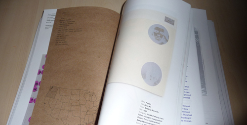
Pages are printed on a variety of papers at three different widths...

Me: The presentation of the book itself echoes the appreciation for unique tactile experiences that seems to have inspired the book in the first place. Were there any crazy hoops you had to jump through to get a book with several sections of half-pages bound?

     “For sure, but we wanted the book to be representative of the content contained within. The book had to be just as much an impressive object as the records showcased are. We did jump through many hoops to finally get the design we wanted, including many many budget revisions, but fortunately we had a great partner in Shapco, who handled the books production. We’re very thankful for their effort in helping to make this book as we dreamed it.”


Deleted Scenes

     The last question I asked was for an example of a record that barely missed inclusion in the book – a “deleted scene” of sorts. Mike conferred with his fellow editors, and came back with a whole list of near-misses. I’ve assembled them below. These are records that didn’t make the final cut for inclusion – so that should speak to the quality of the collection while simultaneously serving as a teaser for what else is out there.

Mike: “Ok, here goes, these are records that ALMOST made it…lots of deals made very late at night surrounding these records…”
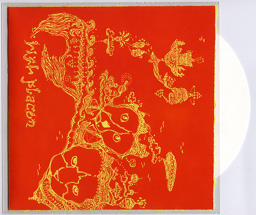
High Places – s/t (Ancient Almanac, 2007)

All sleeve artwork was hand plated and pressed by Rob & Mary of High Places.
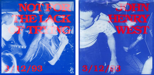
V/A – 3/12/93 (Ebullition, 1993)

“On 3/12/93, Sinker, John Henry West, Manumission and Not For The Lack of Trying played a show at the Anaconda in Goleta, CA. The idea was that all four bands would play a show together and then release a 7″ comp based on that show. Everyone that attended the show wrote their name and address down in a notebook and when the record came out they recieved a copy with a hand screened cover. The cover can be folded to display any of four covers. All of the photos were taken at the show on 3/12/93.” [link]
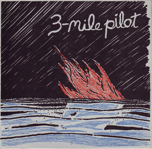
Three Mile Pilot – Piano Minus, Piano Plus (Pennyfarthing Records, 1996)

[I couldn’t find any information about the packaging to this one. Help me, internet…]
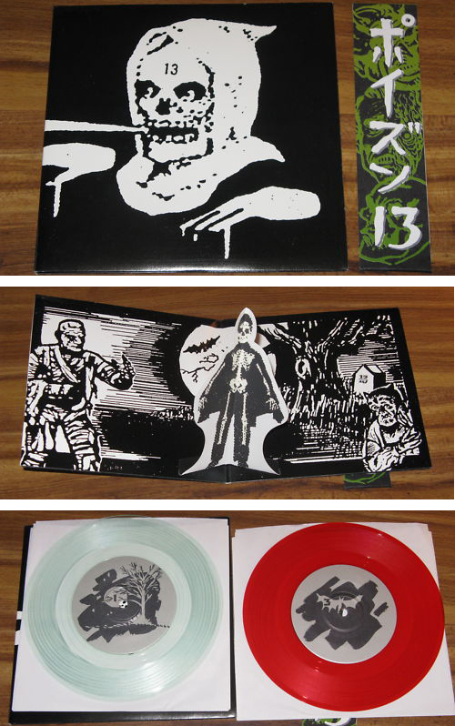
Poison 13 – Ain’t Superstitious (Estrus, 1995)

Double 7″ pressed on clear and red vinyl. Includes gatefold jacket with pop-up glow-in-the-dark skeleton, paper OBI band.
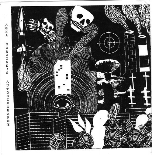
Agna Moraine’s Autobiography – s/t (Anima, 199?)

Hand-made packaging with lyrics silkscreened on four seperate colored cloth patches.
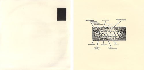
Lake of Dracula / Monitor Radio – split (The Carcrash Label, 1998)

White Vinyl & die-cut sleeve with an actual dental x-ray individually glued in.
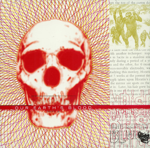
Bastard Noise – Our Earth’s Blood Part III (Rhetoric, 1996)

[Another one for which I couldn’t find any specifics about the packaging.]

Commenter “Housepig” adds: “This was designed by WT Nelson of Thumbprint Press / Unicorn / Bastard Noise, including the design of the custom font on the lower right cover and insert.”
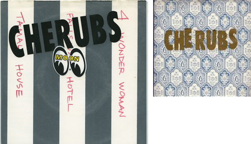
Cherubs – Carjack Fairy (Trance Syndicate, 1993)

Each with unique, hand-cut wallpaper sleeves and vinyl lettering.
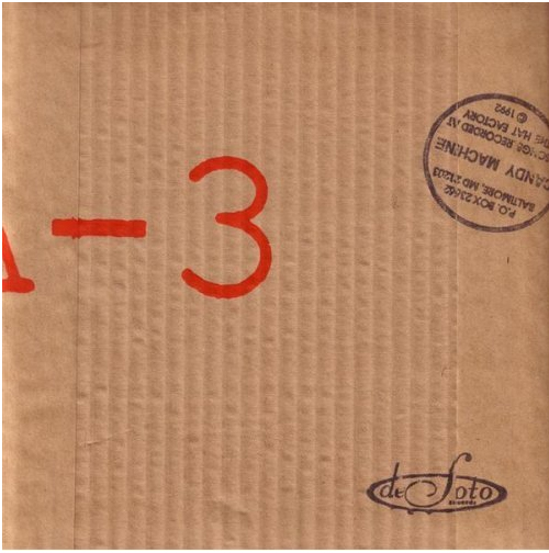
Candy Machine – “History of a Bourgeois Revolution” (Desoto, 1992)

Record was issued in a hand-stamped and screened corrugated cardboard sleeve. “Hard to describe, but the sleeve had to be destroyed to open.”
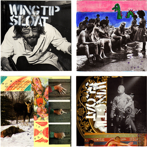
Wingtip Sloat – s/t (Sweet Portable Junket, 1991)

Numbered edition of 500 copies, each copy has two entirely different cover slats and many (dozens) of inserts and pieces of ephemera.
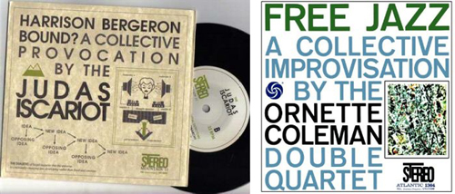
Judas Iscariot – Harrison Bergeron Bound (Mountain, 1997)

[Design apes Ornette Coleman’s Free Jazz design, but I couldn’t find any specifics on the production of the packaging.]
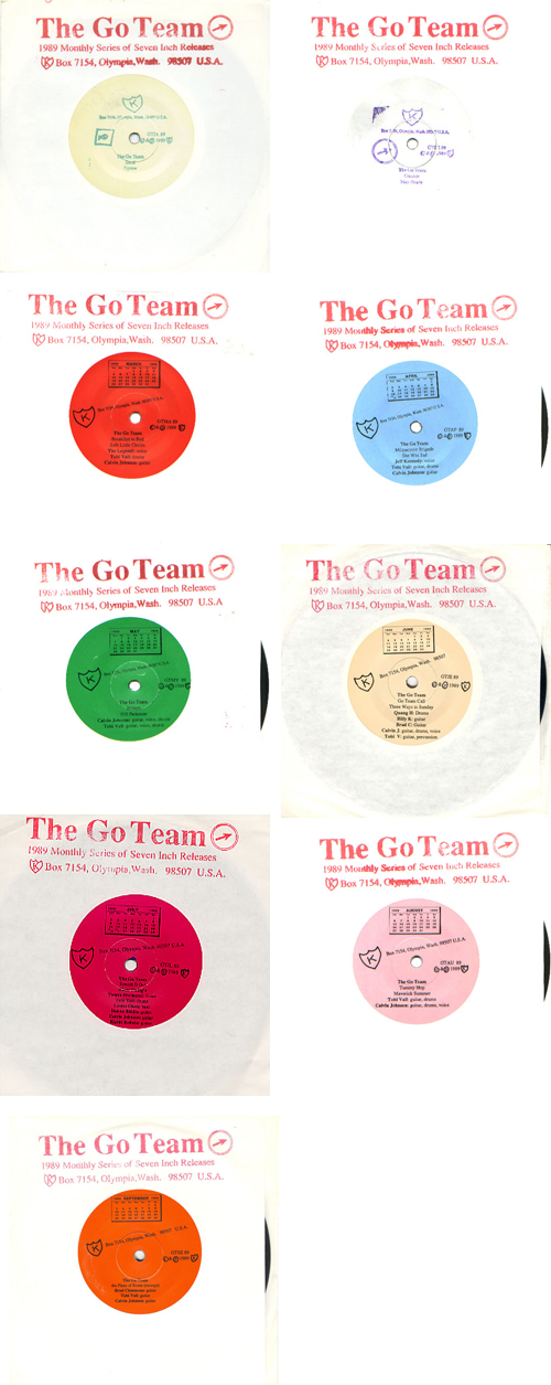
The Go Team – Series (K records, 1989)

Series of monthly releases in 1989. Each record comes bagged in a clear plastic sleeve, with two songs on one side and a custom-silkscreened design on the other. In true Go Team spirit, no two in a row sport the same personnel: Tobi and Calvin play on all of them, and their musician friends stop by to sing or play. [link]


Moving Pictures

     Mike Treff and Henry Owings recently did a lecture of sorts to promote the book, and it’s available on Youtube in three parts. Highly recommended to get a flavor for what the book is all about:

Part One:

Part Two:

Part Three:
The Case of the "Audiosonic Identiglyph"

Updates are at the bottom: update 1, update 2, and update 3. Also: an interview (of sorts) with those responsible for the record.

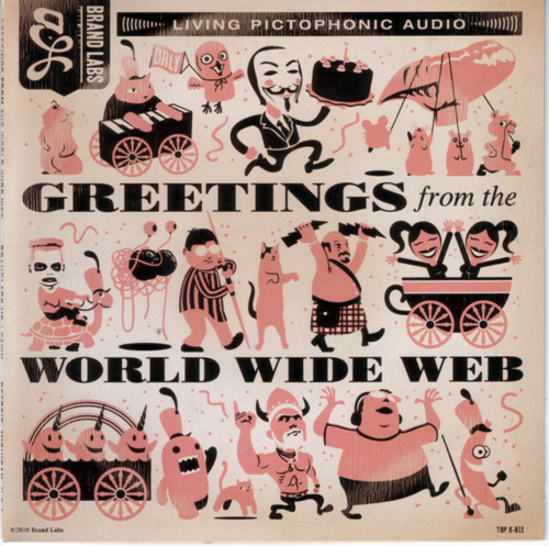
Sometime last week, I became aware of a new 7″ vinyl release called “Greetings from the World Wide Web,” which appears to be a split release between Detroit band Fawn and eCommerce-centric digital agency Brand Labs. The record was described in the Facebook event invitation for its release thusly:

“Greetings from the World Wide Web is a bold experiment in 21st century consumer outreach protocol by Brand Labs of Rochester, Michigan. By utilizing the Audiosonic Identiglyph (AI), the modern businessperson is no longer limited by the archaic constraints of print and digital media when the time comes to seek out new markets. Using the AI allows the businessperson in question to access as yet unreached customers by promulgating the most critical information about their operation in an easy-to-use, algorithmically encoded audio file that is ready-made for broadcast over the public airwaves – ripe to be captured, decoded and interpreted by any clients within range of the transmission. When you think next level ecommerce, think Brand Labs.”

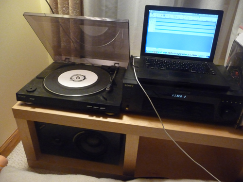
So yes, encoded audio on vinyl: laser targeted to the confluence of my interests. I’ll bite. With full knowledge that I may well be indulging a wild goose chase dressed up in an attempt to “go viral,” I tracked down a copy via a friend, and have since spent a fair amount of time digesting it.

Before I dive into the nerdy bits, though, I’ll say that the Fawn song is good and you can listen to it here.

The Sleeve

The front cover is decorated with a nicely-executed parade of unlabelled illustrations referencing the high points of internet meme-dom, some more obvious than others. The last one in the second row is my favorite – deceptively understated!

Parade o' Memes.

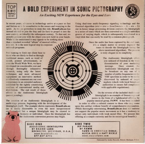
The back cover sports the ‘Audiosonic Identiglyph, surrounded by several paragraphs of purposely stilted-sounding copy. The text claims that the audio on the Brand Labs side of the record is created using the following process:

“Using dual-tone multi-frequency signaling technology and the Goertzel algorithm (s(n) = x(n) + 2cos(2πω)s(n-1) – s(n-2)) our in-house image processing division converts the Identiglyph to a series of tones which are then converted to a single unbroken groove of varying depth, which is subsequently transferred to a vinyl disk that can easily be read by a common phonograph.”

A scan of the back cover is below, clicking it gets a larger file.

The 'Glyph' in question w/ associated patter.

Decoding?

While I originally recorded the encoded audio onto my laptop for de-nerding purposes (see below), Brand Labs have since uploaded an MP3 of the encoded “Identiglyph” here. A note about the mp3 – while this comes directly from Brand Labs, the right channel is a solid square wave of noise – not sure if that’s part of the puzzle or an oversight. Either way, I’ve isolated just the left channel as an MP3 below. You can download the file here.

The finest in nerdy home decor.

[audio:http://kempa.com/wp/wp-content/uploads/2010/09/brand_labs_audiosonic_identiglyph_LEFT_CHANNEL_ONLY.mp3|titles=Left Channel]

After doing some preliminary googling and wikipediaing, it was clear to me that just as the liner notes had indicated, the audio was indeed a high-speed series of DTMF tones (An example that sounds similar can be found in this youtube video). Despite downloading and experimenting with all manner of DTMF decoders, however, I never found a reliable, reproducable decoding of the audio.

Worried that I might be chasing down a joke, I took to twitter to see if I could wrest any clues out of Brand Labs:

@Brand_Labs @Kay_Aitch_Eyy Is your “audiosonic identiglyph” actually decodable? A first pass at DTMF decoding is yielding “99999999” for me.

@adamkempa Via the Director of Marketing: The process of encoding is proprietary, but it involves both the DTMF and the Goertzel algorithm.

.@adamkempa Via our Director of Marketing: “We have a high confidence level that most consumers will meet with decoding success.”

So… that didn’t yield much in the way of new information, and at this point, my “This-is-just-a-dumb-stunt-and-there-is-nothing-encoded” spidey sense was tingling. I tried following up one more time for a hint or at least direct confirmation that there was something to be found:

@Kay_Aitch_Eyy Would your director of engineering agree with that statement? Any recommended decoding method? #keeptrying? #foolserrand?

.@adamkempa Via Marketing Director: “There are no fool’s errands. Work is noble in each case.”

Hm. I still can’t tell if I’m being toyed with, but prefixing every response with ‘Via Director of Marketing’ tends to instill the opposite of confidence in me.

The next night, I did a bit more meddling with DTMF decoders and then I had to call time on the whole ordeal, as I’ve got other projects that are demanding my attention. If it were simply a DTMF encoding, I would think the Brand Labs folks would be counting on a reasonably simple method of decoding it, but I haven’t yet found one. I still believe there’s something encoded there, and in my experience the best way to figure these kinds of things out is to post them on the internet (Case in point).

My suspicion is that there’s some missing piece to the puzzle in the changing numbers of lines in each section of the outer ring of the ‘Identiglyph,” especially as there is a clearly identified ‘Start’ point.

Better quality 'Glyph.'

In the days since I stopped digging, Brand Labs has put up two additional pages here and here, each continuing the pseudo-official tone; and has seemingly issued a press release, which all the copy & paste newswire business blogs have dutifully reposted. I leave this in your hands, internet nerds. Godspeed.

Update!

Lo! Already, the great internet is yielding results! After seeing my plea for help on Twitter, Scott David Herman swiftly deduced that the Identiglyph encodes the latitude and longitude of Brand Labs:

@adamkempa: The identiglyph lines = GPS coords. Outer ring: 42.676409. Inner ring: -83.126796. It’s Brand Labs’ address. bit.ly/baVPTu

This explains the decimal point on the right, and the inverted black and white of the inner ring could even be meant to reflect the ‘negative’ of the longitude.

Decoded!

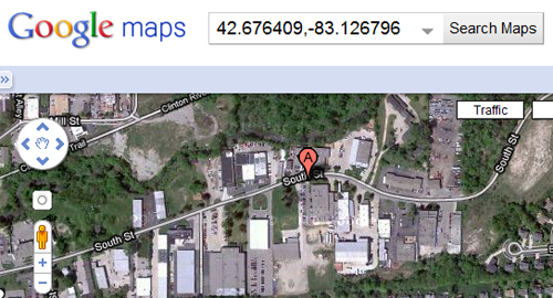
Punching the decoded latitude and longitude into Google Maps…

The encoded latitude and longitude...

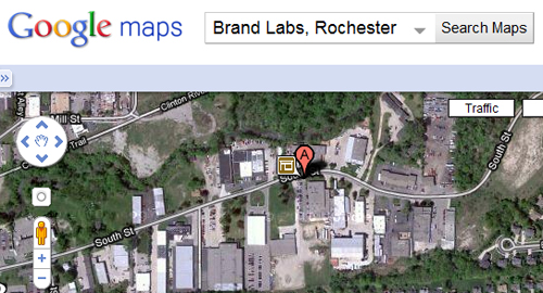
…we get a location in Rochester, Michigan…

Brand Labs on the map...

…which matches up exactly with Brand Labs’ address! Progress!

But where to next?

9/29/10: Another update!

Two more answers regarding the visual Identiglyph:

1.) My co-worker Karl Tiedemann was the first to posit that the three rings of dots around the central icon represented the atomic configuration of silicon:

@adamkempa The dots orbiting the strange nucleus represent the atomic configuration of Silicon: http://ht.ly/2LI88

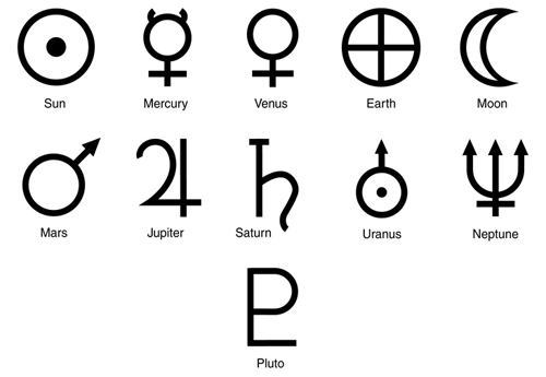
2.) Commenter “Lazenby” reinforces the Silicon hypothesis and also adds that the center-most symbol is the astrological symbol for earth:

So… we’ve got the location of a digital agency, Silicon, and Earth. I guess that kind of holds together? Still nothing on the audio front…

10/3/10: The final chapter?

I’ve been away from email all weekend, so there’s tons of stuff pieced together into this update. Let’s start with some refinements to the interpretation of the imagery we’ve arrived at thus far.

Early on Friday, TheHarmonyGuy noted in the comments to this post that the angular cross / circle shape that surrounds the symbol we had previously identified as representing ‘Earth’ is used in typography to signify ‘Currency:’

Now THIS is a symbol I did not know about.

Soon after, Sid dug further into the symbols at the center of the glyph, noting that the ‘Earth’ symbol at the center has held many varied meanings, and further pointing out that the ‘Currency sign’ can also denote a Hexadecimal number, which was much more likely to be applicable in this case:

Both the above-mentioned Sid, and another commenter on this post, ASDR, made valiant attempts at decoding the DTMF tones, but ran into very much the same results as I did in my efforts: each DTMF software decoder they attempted to use arrived at different results.

Late on Thursday night, I had posted a question on Ask Metafilter, seeking recommendations for ways in which to attack the DTMF decoding. There, a poster recommended slowing down the recording but maintaining the pitch, so that slow decoders might perform better on the recording. I tried this without any luck and at this point it dawned on me that since resolving a DTMF tone to it’s respective data is heavily dependent on accurately reading the frequencies, any change in pitch could make the recording almost impossible to improperly decode. I compared the MP3 with the original audio I pulled off the vinyl, and noted a noticable difference in pitch, so I was rapodly losing faith in the decodability of the audio.

Late last night, Metafilter user Rhomboid posted his findings to the Ask Metafilter thread. His description of the encoding and how he cracked it is meticulously detailed, based on a string of smart solutions compensating for the frequency inconsistencies. He even shared the source of the custom Perl script he ended up writing to do the decoding.

Decoding the tones with adjusted frequency expectations resulted in 22221 symbols, which were then converted to binary and renamed as a JPG, producing the 216×216 Identiglyph image below:

While there are still some unanswered questions (Earth -> Currency / Hexadecimal -> Silicon -> Brand labs?), I was mostly interested in the encoded audio, so I’m satisfied. I’ve inquired about talking to the team who put this together, so an epilogue to this whole affair may appear at a later date.

In the meantime, a HUGE thanks to everyone who played a role in cracking this: Rhomboid for doing the heaviest lifting in walking the audio all the way through to an image; ‘ADSR’ for spending time further exploring the DTMF angle after I’d given it up; Scott David Herman, Karl Tiedemann, ‘Lazenby,’ Sid, and ‘TheHarmonyGuy‘ for providing bits of the visual Identiglyph Puzzle, and Andy Baio for helping get the word out to the nerds of the internet (The number of seemingly automated Twitter accounts that simply retweet his link feed truly surprised me, though it shouldn’t have – as it has remained the gold standard for so long). Oh, also the internet, for always making any question I post on it get answered, except for in enterprise software support forums. Even the magic of the internet doesn’t work there.

1/2/11: The creators speak (But never break character)

After the dust settled on the decoding excitement, I emailed Brand Labs in an attempt to speak candidly about the project. They agreed to answer any questions I had, but never broke character in doing so. I’ve pasted the full exchange below for the curious.

What were the origins / inspirations of the project?

As we began to dig below the candy-colored surface of today’s social media and digital marketing, we began to see an entirely untapped source of consumer outreach: namely, algorithmically-encoded analog audio. It was so very obvious that we nearly tripped over it. As for our inspiration, we drew from a classic: NASA’s Golden Record from its Voyager missions. It bore the fundamental elements we felt were lacking from current marketing outlets and its mission was simple – tell the audience who you are, what you do and where you may be found. From that inspiration, it was a clear, straight line to our final product. Even the inclusion of popular music as a cultural touchstone for anyone who came upon the artifact (in this case, “Hip Parade” by FAWN) was directly inspired by NASA’s inclusion of Charles Berry’s composition in their project.

Was the intent that the audio would actually be decoded, or was this meant as a “No one will ever do this” exercise in absurdity?

It has always been (and continues to be) our assertion that the public would be able to easily discern our intention, and that they would certainly have a basic understanding of the Goertzel algorithm and dual-tone multi-frequency signaling technology (we did all go to junior high school, after all).

Were you surprised at how quickly the audio was decoded?

We believe the speed with which the audio and the Identiglyph were decoded simply proves our original assertion that the public’s interest and aptitude in amateur cryptography must never be underestimated. In point of fact, had it taken longer we would have been sorely disappointed in mankind in general.

Were you surprised at some of the variance that got introduced, and how involved the decoding got?

A great man once said that one man can never fully know the mind of another. If one accepts that as an ultimate truth (as we do) it follows that a certain amount of unpredictability must be engineered into any given process, as was the case here.

So… “Audiosonic Identiglyph…” …really?

We occasionally and arbitrarily disdain the contemporary trend of assigning “catchy” or “clever” names to items that may be better described in a clear and straightforward manner. In this case, we chose to call a spade a spade.

Encoded audio on vinyl, speaks to a very niche market – was that the target?

Our target is universal and our goal was to ensure the durability of our message. The vinyl “record” offers many durability benefits that digital media does not. As for the encoding element, the simple fact is that languages die (e.g. Esperanto or Canadian) and we’re in this game for the long haul. We intend to be offering online commerce consulting and marketing services long after the English language is nothing more than a quaint memory.

Has everything encoded in the record been properly deciphered? Or are there still a few details we’ve got wrong?

To the best of our knowledge, the lion’s share has been fully decoded with the possible exception of the precise location of D.B. Cooper and the remainder of his ill-gotten gains, however, as that portion of the project wasn’t central to our goal, it would be fair to say that the decoding is complete.

What has the feedback been like so far?

To this point, the feedback has been equal parts amazement, ennui and rabid consumerism, which, in the introduction of any bleeding edge technology, is an entirely predictable result.

Infinity.

This is such a horrible idea, it has to have been done before. Just in case, though, I’ve posted it here. Inspired by this tweet, I give you my artistic masterwork. I call it ‘The Circle of Life.’

The Circle of Life

Crazy, sequential batch of 1990's design

A nerdy comics-centric project I’m working on has left me with a byproduct that I figured might be of interest to a few weirdos out there, so I’ve uploaded it to the internet.

The “byproduct” is a photoset containing a decent percentage of the covers to Chicago’s “NewCity” (A free arts weekly) published from 1992ish through 1997ish (Actually: the oldest cover is from 1991, and the most recent is from November 18th, 1999 – but there are gaps throughout). A wealth of 90’s design!

Why do I have these? Comic artist Chris Ware published much of his “Jimmy Corrigan: The Smartest Kid on Earth” graphic novel serially in the pages of NewCity throughout the 90’s, and I’ve been steadily accumulating issues for awhile now. The bulk of these issues were handed off by Steve Dalber, who will probably be shocked to see I’m finally doing something with them.

Some “highlights,” from my skewed perspective:

  • 12/26/1991 – I think this cover is Ware’s first’s published work in Chicago?
  • 5/21/1992 – “Acme Cartoons” officially starts running – teaser on the cover in vibrant magenta!
  • 12/31/1992 – Ben Katchor cover.
  • 7/29/1993 – The Liz Phair backlash begins…
  • 9/30/1993 – Ware’s “Best of Chicago” cover.
  • 4/14/1994 – Chicago weighs in on Kurt Cobain’s Suicide.
  • 12/29/1994 – Ware / Walt Holcombe cover collaboration.
  • 9/28/1995 – Mitch O’Connell’s “Best of Chicago” cover.
  • 1/18/1996 – Tortoise grace the cover.
  • 3/7/1996 – Another Mitch O’Connell cover.
  • 10/24/1996 – A young-looking Wilco on the cover.
  • 12/25/1997 – Another Ware cover – this one’s a wraparound.

If you should have any desire to own ~230 issues of “NewCity” minus the comics, get in touch – you can have them for the cost of shipping.